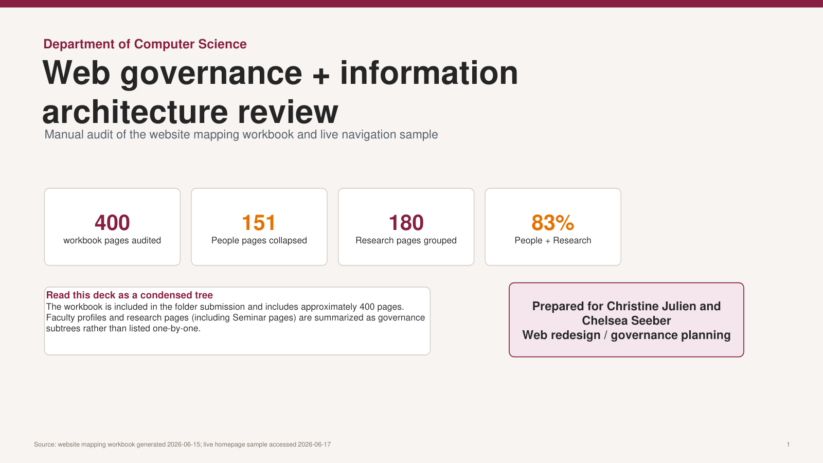
Turning a 400-page website into an audience decision system
A department-wide audit connected content inventory, user behavior, accessibility, peer benchmarking, governance, and phased implementation so redesign decisions could be made with evidence instead of preference.
400pages mapped
52,805active users analyzed
146,573page views analyzed
37.5%of views on the top 20 pages
Audit evidence was translated into a governance model, audience pathways, a future-state architecture, and a sequenced redesign plan.
Challenge
The site was active, but broad landing pages and internal organization were not moving people cleanly to high-value tasks. A large inventory, inconsistent ownership, broken links, and mobile-hidden calls to action made the redesign both a user-experience problem and a governance problem.
Strategy
Start with what users were already showing us. I combined a 400-page map with GA4 behavior, search patterns, accessibility and link findings, live-navigation review, and Purdue/Cornell benchmarking. The work shifted the redesign brief from "refresh the pages" to "organize around user intent."
My role
I owned the analysis and translated it for department and college leadership: baseline report, issue prioritization, architecture review, audience pathways, governance roles, measurement framework, and a staffing-realistic operational plan. I also separated AI-assisted analysis from AI-mediated discovery and incorporated answer-engine optimization into the content model.
Work
The recommendation rebuilt the homepage as a decision gateway; created direct pathways for prospective and current students, faculty, research partners, industry, alumni, and donors; defined reusable content patterns; prioritized credibility cleanup; and assigned a repeatable review cadence.
ECE relevance
This website audit demonstrates communications strategy grounded in audience needs, institutional priorities, and measurable digital behavior. It shows my ability to translate analytics, content patterns, accessibility considerations, and stakeholder goals into a practical plan for improving how an academic department presents itself online and helps six key audiences get the information they need.
Result
Leadership received a focused plan grounded in observable behavior: the top 20 pages accounted for 37.5 percent of views, specific task pages consistently held attention longer than broad hubs, and the site's 400 pages could be sequenced by risk and audience value. The result was a practical roadmap, not a cosmetic redesign wish list.
Supporting artifacts
The work behind the recommendation.
Original planning materials are provided in their native formats so the analysis, method, and decision trail remain visible.